
🔥 Bad First Date App Update Meme Format
Instantly relatable meme template for tech frustration humor
Ever update an app and suddenly feel like you’ve been digitally gaslit? You’re not alone. Welcome to the glorious, frustrating world of Feature Updates Gone Wrong, where the only thing getting an upgrade is our collective blood pressure.
It’s a simple cycle we all know too well. You open your favorite, perfectly functional app one morning, and it’s been given a “fresh new look.” Your muscle memory is useless, the button you need has vanished into the digital void, and the only new feature you can find is a profound sense of loss. Over 500 upvotes on a recent Reddit thread prove we’re all living the same nightmare.
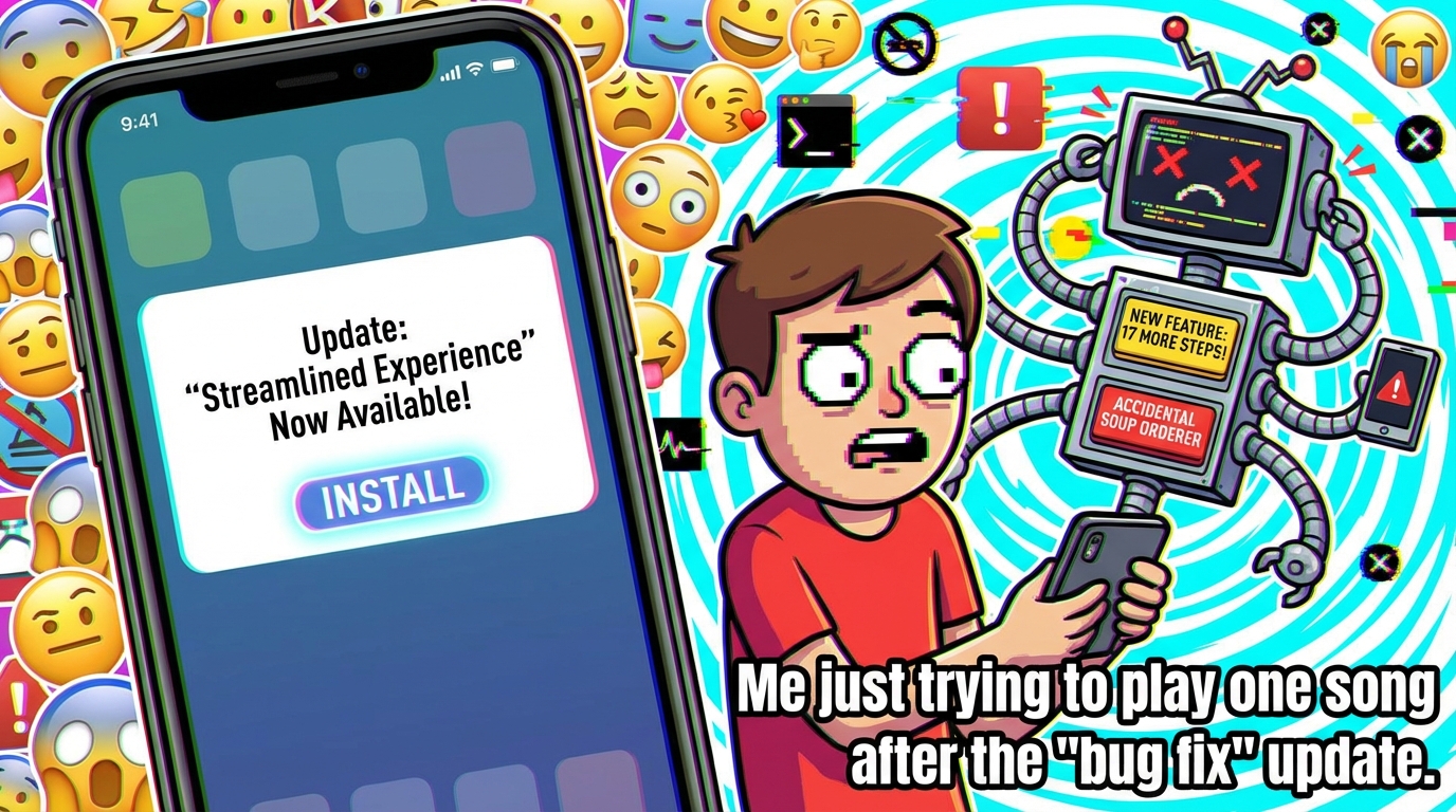
There’s a special kind of comedy in the sheer confidence of these updates. Some designer somewhere said, “You know what users will love? If we hide the ‘save’ button behind three swipes and a interpretive dance.” It’s like someone rearranged all the furniture in your house while you slept and then acted surprised you tripped over the couch now in the kitchen. The commitment to fixing what wasn’t broken is almost admirable.
My favorite part is the update notes. They never say, “Moved everything to confuse you.” It’s always “Streamlined the user journey for a more intuitive experience!” Intuitive for who, a space alien? The disconnect is so vast, it’s hilarious. We went from using an app to becoming unpaid beta testers for someone’s avant-garde art project.
So next time an update drops and you spend ten minutes looking for your own profile, just remember: you’re not crazy. You’re just participating in the internet’s favorite unscripted comedy show, where the punchline is your own frustration. Now, if you’ll excuse me, I have to go find where they hid the logout button this time.
Quick Summary
- What: This article explores why app updates often frustrate users by removing familiar features.
- Impact: It validates user frustration and highlights a common digital experience many face.
- For You: You'll learn why updates feel disruptive and gain perspective on this shared annoyance.


💬 Discussion
Add a Comment