
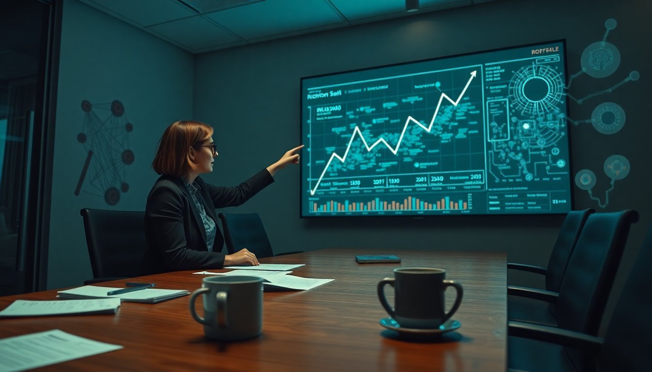
METR's Chart Is Weaponizing the AI Arms Race
The METR chart measures how quickly AI systems complete complex tasks, but its real impact is as a catalyst for a dangerous scaling war. This article argues that the chart's simplicity masks a profound distortion of what 'progress' actually means.
A single chart, born in a nonprofit's spreadsheet, now dictates the pace of the entire AI industry. METR's measurement of 'task completion time' has become the scoreboard that OpenAI, Anthropic, Google DeepMind, and Meta all obsess over—and it is warping their priorities in ways most investors don't understand.
- METR, a nonprofit AI safety organization, published a chart measuring how fast AI systems complete complex tasks (like coding or research) over time.
- The chart shows an exponential improvement from GPT-3 (2020) to current frontier models (2026), with task completion time dropping from days to hours.
- This single visualization has become the industry's de facto benchmark, replacing more nuanced evaluations of safety, reliability, and cost.
- The key tension: is this chart a genuine measure of progress, or a self-fulfilling prophecy that incentivizes companies to chase speed at the expense of everything else?
Why Has One Chart Become the Industry's Obsession?
METR's chart, first published in late 2025 and updated quarterly, plots a simple curve: the time required for a frontier AI model to complete a standardized set of 150 complex tasks—ranging from writing a full codebase to synthesizing a research paper. The y-axis is logarithmic, and the line is nearly vertical. From GPT-3 in 2020 (taking an average of 72 hours per task) to Gemini Ultra 2 in early 2026 (taking 45 minutes), the improvement is staggering.
According to the NYTimes report, METR's researchers have seen their inboxes flooded with requests from every major lab. "They want to know how to move up the curve," a METR spokesperson told the Times. The chart has become a shorthand for 'who is winning.' But this is dangerous. A single metric that rewards speed above all else inevitably leads to corner-cutting.
My take: This chart is the AI equivalent of the S&P 500—everyone looks at it, but it tells you nothing about volatility underneath. Companies are now optimizing their training runs specifically to improve their METR score, not to build better products.
Who Benefits From the Obsession With Speed?
The direct winners are the frontier labs with the deepest pockets: OpenAI and Google DeepMind. Their ability to pour billions into compute allows them to compress task completion times faster than any competitor. Anthropic, despite its safety-first branding, cannot afford to ignore the chart—it would be seen as falling behind.
The losers are everyone else. Smaller labs like Mistral, Cohere, and AI21 cannot compete on raw scale. Their models may be more efficient, cheaper to run, or safer, but they will never top the METR chart. The chart also punishes models that prioritize interpretability or robustness over raw speed. A model that takes 10% longer but is 50% more reliable gets a worse METR score.
This is a classic Goodhart's Law scenario: when a measure becomes a target, it ceases to be a good measure.
Does the METR Chart Actually Measure Intelligence?
No. It measures one thing: how fast a model can complete a pre-defined set of tasks under ideal conditions. It does not measure generalization, safety alignment, factual accuracy, or cost efficiency. A model that scores high on METR could still be dangerous, unreliable, or economically unviable.
Consider this: a model that completes a codebase in 2 hours but introduces 12 critical security vulnerabilities would score better than a model that takes 3 hours but produces secure code. The chart has no penalty for poor quality. It is a speed test, not a quality test.
My interpretation: The industry's embrace of this chart is a collective act of self-deception. It allows labs to claim progress without being held accountable for the downstream consequences of their systems. It is a marketing metric masquerading as a scientific one.
| Metric | METR Chart | Real-World Value |
|---|---|---|
| Task Completion Speed | ✅ Measures | ❌ Ignores quality |
| Safety Alignment | ❌ Ignores | ✅ Critical |
| Factual Accuracy | ❌ Ignores | ✅ Critical |
| Cost Efficiency | ❌ Ignores | ✅ Critical |
| Generalization | ❌ Ignores | ✅ Essential |
| Verdict | Marketing Tool | Actual Progress |
What Does This Mean for Regulation and Safety?
The METR chart is being used by both sides of the regulatory debate. AI optimists point to it as proof that capabilities are growing exponentially and that regulation should be light-touch to avoid stifling innovation. AI pessimists point to it as proof that capabilities are outpacing our ability to control them.
The EU AI Office has already cited the chart in internal briefings, according to sources familiar with the matter. The U.S. AI Safety Institute has requested raw data from METR. The chart is becoming a policy tool, which is terrifying because it was never designed for that purpose.
My prediction: Within 12 months, a major incident will be traced back to a model that was optimized for METR speed at the expense of safety. At that point, the chart will become a liability for everyone who promoted it.
My thesis is clear: The METR chart is the most dangerous single visualization in AI today. It is not a neutral measurement; it is a weaponized benchmark that is driving the entire industry toward a cliff of unchecked scaling.
In the short term, the chart will continue to dominate headlines and investor decks. OpenAI and Google will claim victory. Anthropic will try to spin its lower score as a sign of 'safety first' but will quietly invest more in raw speed. The losers are the open-source community and smaller labs, who will be framed as irrelevant.
In the long term, I expect a backlash. The first time a high-METR model causes a real-world disaster—a financial market disruption, a security breach, a medical error—the chart will be held up as evidence of negligence. The labs that promoted it will face scrutiny.
Who gains? The AI safety community, because they will have a concrete example of how narrow metrics distort progress. The regulators, because they will have a clear target for intervention. Who loses? The frontier labs, because they painted themselves into a corner by chasing a metric they cannot now abandon without looking weak.
I predict that by Q1 2027, at least one major lab will publicly distance itself from the METR chart, calling it 'incomplete' or 'misleading.' The lab will be Anthropic, because they have the most to lose from a speed-only race and the most to gain from a safety-focused narrative.
- Anthropic will publicly disavow the METR chart as a primary benchmark by March 2027, citing its failure to account for safety and reliability.
- The EU AI Office will require any model that achieves a METR score below 1 hour to undergo mandatory pre-deployment safety testing by Q3 2027.
- A startup will emerge in 2027 offering 'METR-adjusted' evaluations that penalize speed without safety, creating a competing benchmark that gains traction among enterprise buyers.
- Late 2025METR publishes first version of the chart
The chart shows GPT-3 taking 72 hours per task, Gemini Ultra 2 taking 45 minutes.
- Early 2026Industry obsession begins
Frontier labs request access to METR's methodology and begin optimizing for the chart.
- April 2026NYTimes article publicizes the chart
The chart becomes mainstream, cited in investor calls and regulatory briefings.
- Q1 2027 (predicted)Anthropic distances itself
Anthropic publicly criticizes the chart as incomplete, pivoting to safety-focused benchmarks.
- Q3 2027 (predicted)EU mandates safety testing
EU AI Office requires pre-deployment testing for models with METR scores under 1 hour.
- Late 2025METR publishes first version of the chart
The chart shows GPT-3 taking 72 hours per task, Gemini Ultra 2 taking 45 minutes.
- Early 2026Industry obsession begins
Frontier labs request access to METR's methodology and begin optimizing for the chart.
- April 2026NYTimes article publicizes the chart
The chart becomes mainstream, cited in investor calls and regulatory briefings.
- Q1 2027 (predicted)Anthropic distances itself
Anthropic publicly criticizes the chart as incomplete, pivoting to safety-focused benchmarks.
- Q3 2027 (predicted)EU mandates safety testing
EU AI Office requires pre-deployment testing for models with METR scores under 1 hour.
- The METR chart is not measuring intelligence; it is measuring compute expenditure disguised as progress.
- Investors who use this chart as a proxy for 'winning' are making a category error that will cost them.
- The chart's simplicity is its greatest weakness—it hides the complexity of real-world AI deployment.
- Regulators should treat this chart as a warning signal, not a validation of capability.
- The true winners of the AI boom will be those who build reliable, safe, and cost-effective systems, not those who top a speed chart.

Source and attribution
NYTimes Technology
How Do You Measure an A.I. Boom?




Discussion
Add a comment